Assignment Write-Up:
This project steered away from my original concept yet broadened my limitations. Instead of trying to express rebellion through images my mind stuck on (cowboys). I can find more imagery by broadening my concept to my art and experiences. The first project featured some of my sketches of cowboys while the second was more imagery inspiration for it. This last project animates the part of art in Mexican culture I found the most intriguing upon my visit their last year. I took characters and works of interest I photographed in the Museum of Mexican Folk art in Mexico City. I tried to create a simple context the characters could interact with that also expressed my experience in graphic design. I am excited to see what direction this project is taking me in. I aim to create more works like these to showcase my art and experiences.
i'm unsure what your concept is anymore. i realize you've changed direction but i'm not sure where that direction is. about the piece itself, i don't know if the text "Mexican Folk Art" is necessary. I think I would have liked it better without that part. I get by the imagery that it is some kind of spanish/native influenced art. and the background screams desert so i ultimately assume you're thinking of mexico. the animation itself is very nice and clean.
ReplyDeleteI think the piece would be better without the typography as well. I do like the background color, maybe make a slight radial gradient from it to give it a little bit of depth that the flat color doesn't. The overall aesthetic and colors flow together, but I'm definitely confused as to where your concept has gone as well.
ReplyDeleteHA! I think this is great with all of the imagery. Everything feels like it fits and comes across as a nice movie intro. It seems like you really drew inspiration from all of the videos posted on your blog. I want to say add some more to the background to ground some of the figures but I don't know if you really need it.
ReplyDeleteI do get the idea of an environment created specifically to reflect mexican folk art. Because of that, I also think the text in the beginning is unnecessary. If you want to have such a blatant declaration of your movie's subject matter, would it be more effective if you actually had a sign from mexico or something?
ReplyDeleteI like your characters in this, they remind me very much like your puppets you made for digital cinema. I agree with everyone about the text not being needed. I think I could recognize the mexican theme with out it to be honest. Other than the mexican theme I cant really see the concept here. Keep experimenting!
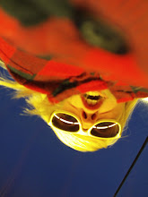
ReplyDeleteI love the use of color and collaged elements. I love the end when the more illustrative flowers come into the scene with the photographed masked figured. It gives a nice contrast. When this begins I felt like there was a narrative in store, but instead got a shifting of various imagery. I kind of with there was something more going on than a moving collage. Maybe try to buckle down on your concept, whatever that may be as of now, and come up with some themes or moods that you want to express. I think the motion was successful. There was tons of stuff going on so I can tell you put in a decent amount of work.
ReplyDelete